Algonquin Times
Transformed users into reporters.
Summary
The Algonquin Times is an award-winning student-run newspaper at Algonquin College produced bi-weekly. To increase online presence and reach different audience throughout the campus, the journalism department saw an opportunity with increased usage of the mobile apps.
Role
User research
Sketching
Low-fi mockups
Hi-fi mockups
Team
Description of the team you worked with.
Tools used
Balsamiq
Adobe XD
Google docs
Xcode & Android studio
Timeline
15 Weeks
Problem statement
Due to increase in screen time, the users were spending more time online to stay up to date with the latest news and trends which reduced the popularity of print media. Thus, to get up to speed with the technology, the journalism department decided to build a mobile application.
- Category: Mobile App design
- Launch: Jun 2018
- Deliverables: Native apps for iOS and Android
User research
To understand the users of Algonquin times, the target audience was divided into following categories:
- Current students
- College alumni
- Management
For quantitative research, we set up an online surveys to gather early insights from audiences. We set up 3 surveys and managed to get feedback from 270 people from the target audience.
To better understand how all these insights will fit into people lives, we conduced one-on-one interviews to find out their goals and frustrations.
Key findings from user research
- Younger audience uses social media to stay informed on the latest trends
- Search and filtering news by category were the most popular features
- Socializing with other people around the campus was a hidden need
- People prefer news apps instead of visiting websites or watching TV
- Share news with closed ones was the main action
- People love sharing their personal opinions
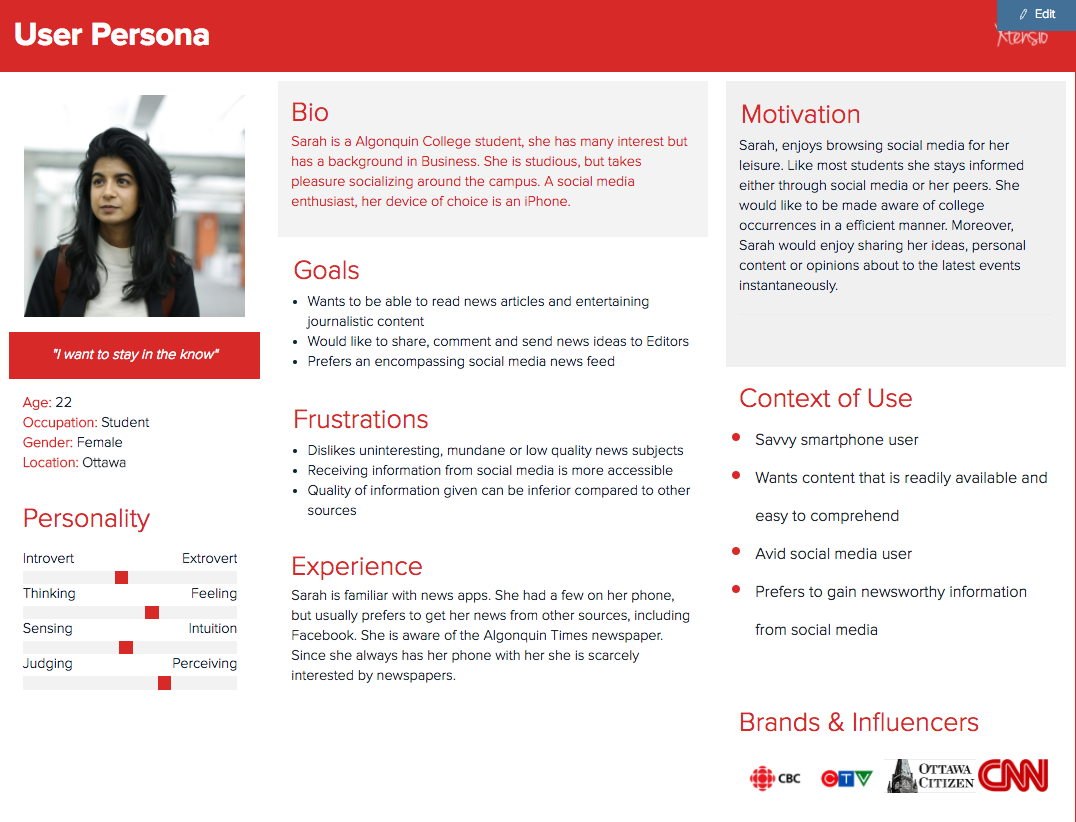
User personas
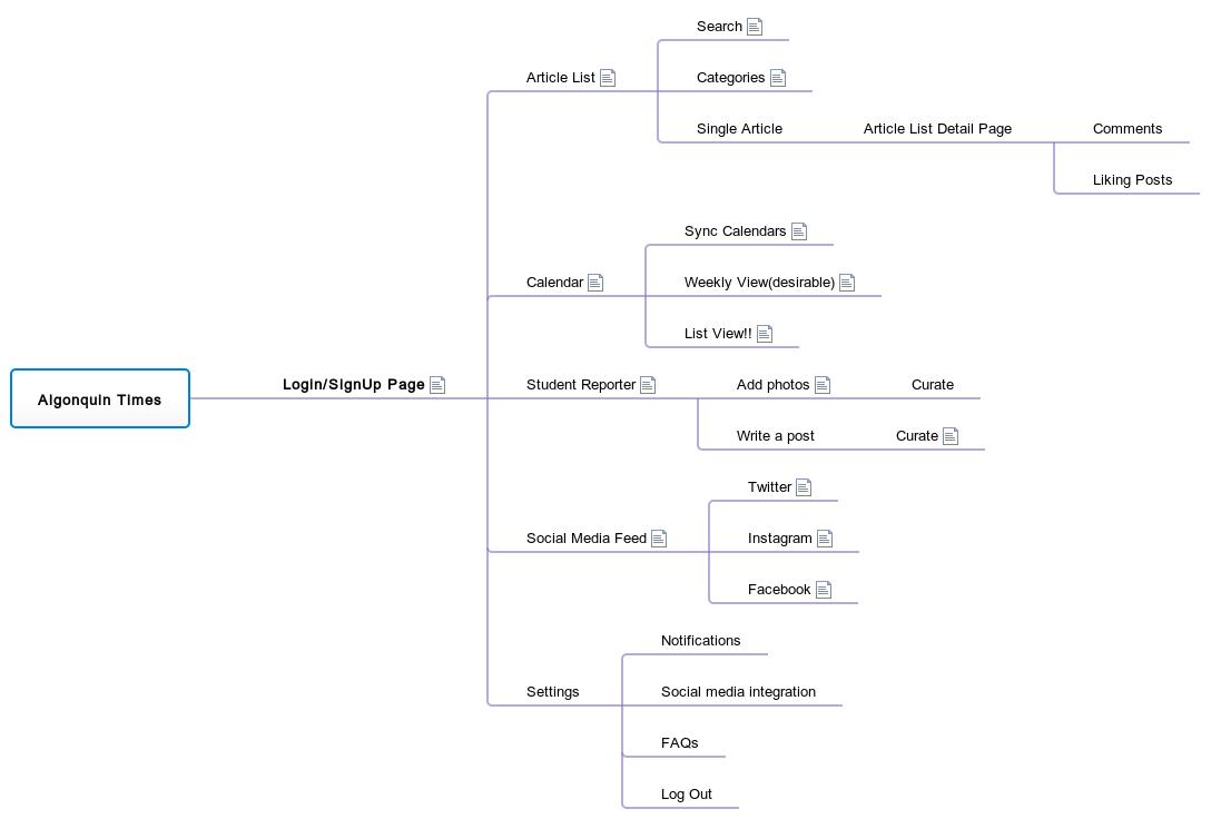
Information architecture
Sketches
To come up with ideas quickly, I used pen and paper before jumping to concrete solutions. By doing this, I was able to spot the mistakes that could disconnect the layout.
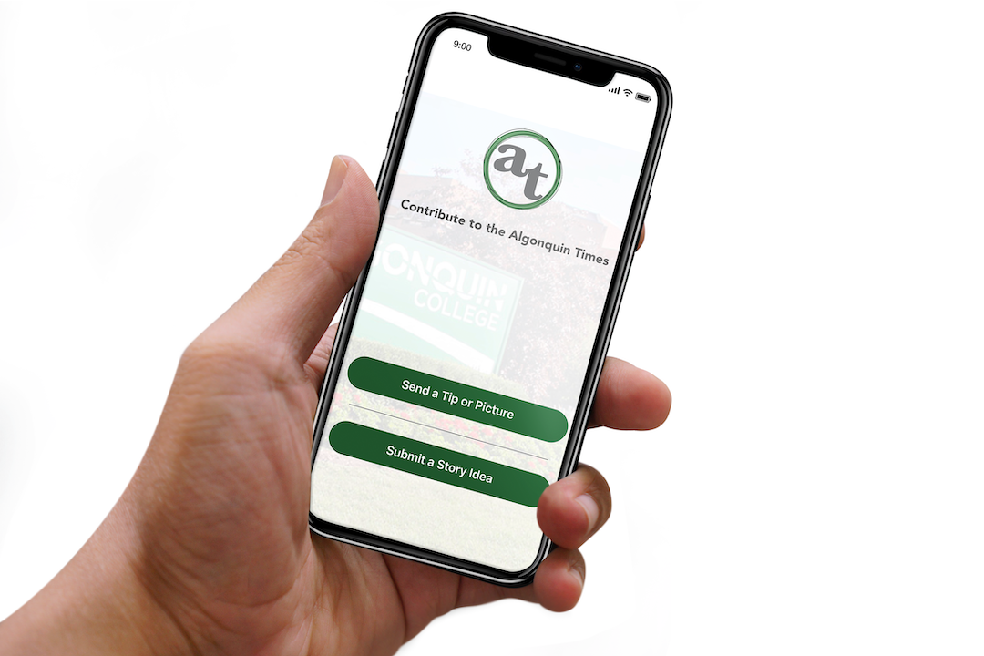
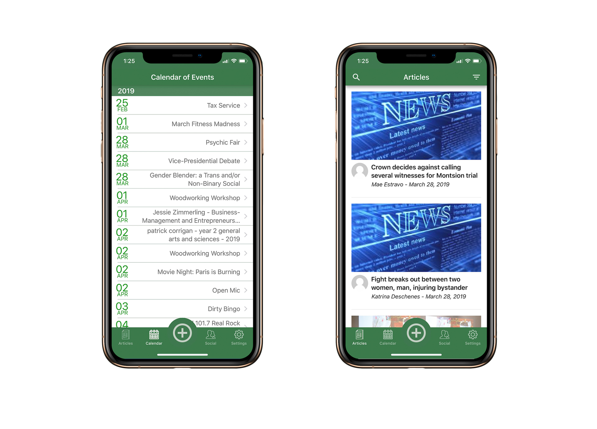
- Sketch 1:: Shows layout of the articles screen for iOS devices. Since, Search and filtering news based on the topic were two of the main features. I decided to place them on the home screen of the app.
- Sketch 2:: Represents layout for Android devices. It follows Material guidelines and common app patterns from other news apps. The images on this screen have been shifted on the right to see the difference in content layout.
- Sketch 3:: Connects different screens and changes action based on the task user is completing.


Wireframes
TI took the lead on designing the calendar feature, event description and making the screens interactive. The principal purpose of the sketches was to map out user journeys smoothly and remove any friction.


Visual design
Using the feedback we received from wireframes evaluation and initial user research findings, I took the lead in creating a visual design for iOS platform.